Ranking
Ranking
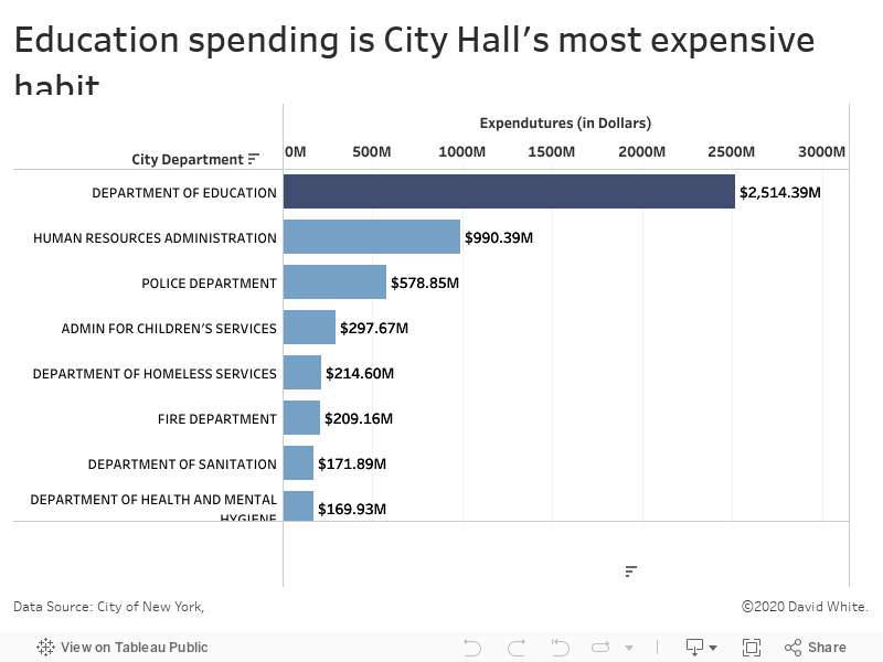
Ranking visualizations are graphs that show two things at once: (1) How much of something you have and (2) How that rates in comparison to how much others have.
My method:
First, I gather, clean up and plot the data. Then, I study the visualization I've created and initially I look for three things:
Who has the highest ranking?
Who has the lowest ranking?
Are there clusters of people who achieved similar results?
The answers to the first three questions typically lead to another set of questions to investigate and discuss with stakeholders:
What caused some scores to be high?
What caused others scores to be low?
What do the people with similar scores have in common?
What else could be going on that might be an influence on the results we're seeing?
Exemplar Ranking Data Visualization by David White