Distribution
Distribution
Distribution visualizations are graphs that illustrate how frequently something occurs.
My method:
First, I gather, clean up and plot the data. Then, I study the visualization I've created and I look at the shape of the graph:
Let's say for example that I’m looking at a list of exam scores for a group of students. If the curve of the graph takes on a bell shape, that means everything is normal. (Nothing unexpected has occurred with on the exam.) If the curve of the graph leans to the left, that tells me that an unusually large number of students earned low exam scores. (Maybe the exam was unfair. Maybe some of the exam's topics need to be re-taught.) Conversely, if the graph leans to the right that means that an usually large number of students earned high exam scores. (Maybe the exam was not challenging enough. Maybe some students should be placed into an advanced class.)
The distribution graph helps me quickly identify when something is happening either more often or less often than one would normally expect. When looking at a distribution graph, we normally expect to see a bell-shaped curve. My attention is drawn to examples where the shape of the curve turns out not to be what we expected. In these cases the question then becomes “What’s causing this unusual situation to occur?”
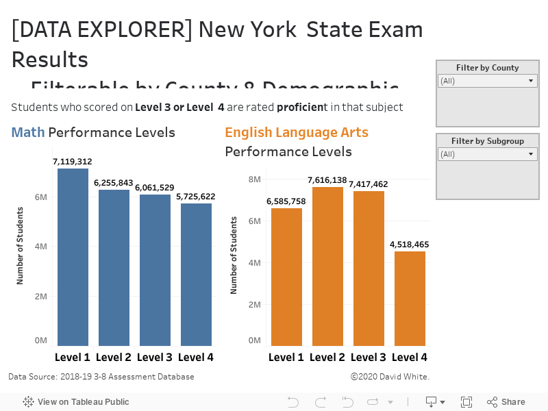
Exemplar Distribution Data Visualization by David White