Deviation
Deviation
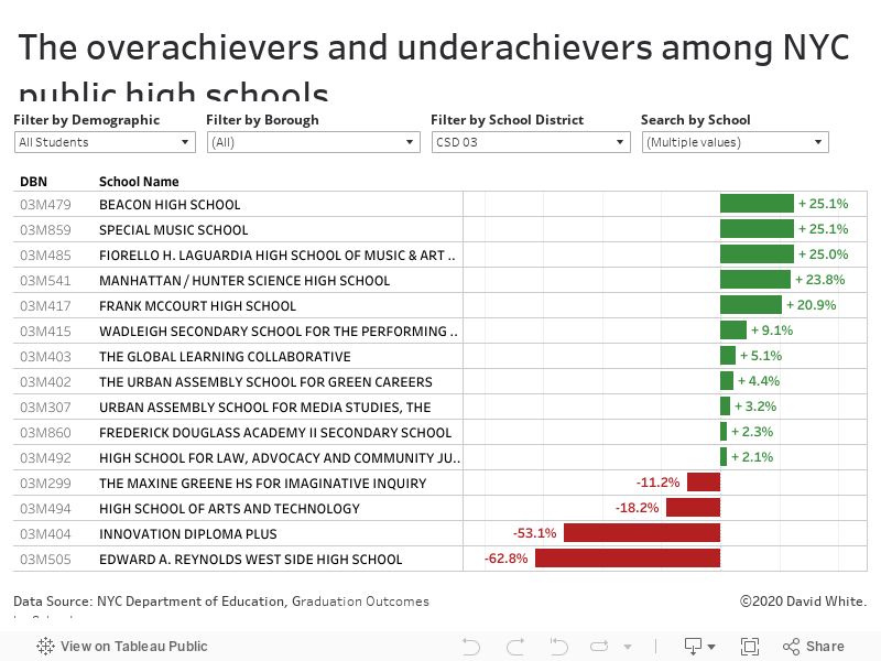
Deviation visualizations are graphs that show how far above or how far below the average something is. They show how much something differs from what's normal.
My method:
First, I gather, clean up and plot the data. Then, I study the visualization I've created and I look for two things:
Where is does the average fall? (What's considered "normal" for this set of information?)
Is there anything that stands out significantly from the average?
Here, I’m looking for anything that really stands out from the crowd. (It’s is much easier to gather this kind of insight from looking at a data visualization as opposed to just staring at a row of numbers on a spreadsheet.) If something does in fact stand out, then the question becomes "Why is this happening? What's going on with these individuals?” The deviation data tool helps me investigate what's really happening on a deeper level.
Exemplar Deviation Data Visualization by David White