Change-over-Time
Change-Over-Time
Change-over-time graphs illustrate how something has changed over the course of time.
My method:
First, I gather, clean up and plot the data. Then, I study the visualization I've created and I look for three things:
Are there any noticeable patterns in the data? (Looking at the data in a visual format really helps here. Data visualizations often reveal insights that would otherwise be hidden within a maze of numbers.)
Where are the highs and lows?
Is there anything shown in the data that is not what I expected to find?
The change-over-time graph is a tool that helps me ask better-informed follow-up questions. It helps guide me as I gather clarifying information and it helps me place that information into context. Let's say, for example, that after looking at a time series graph I notice that one particular point is much higher than all the others. I might ask "What else was happening on that day? What could have caused this to happen?"
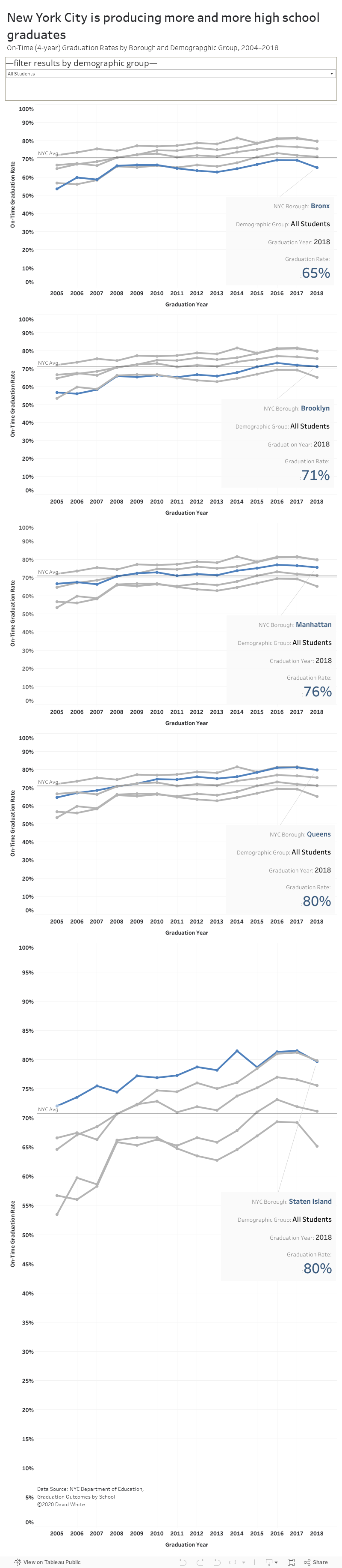
Exemplar Change-Over-Time Data Visualization by David White