CSY-020. An infographic that briefly summarizes a large set of data.
PROJECT COMPLETED: July 2021
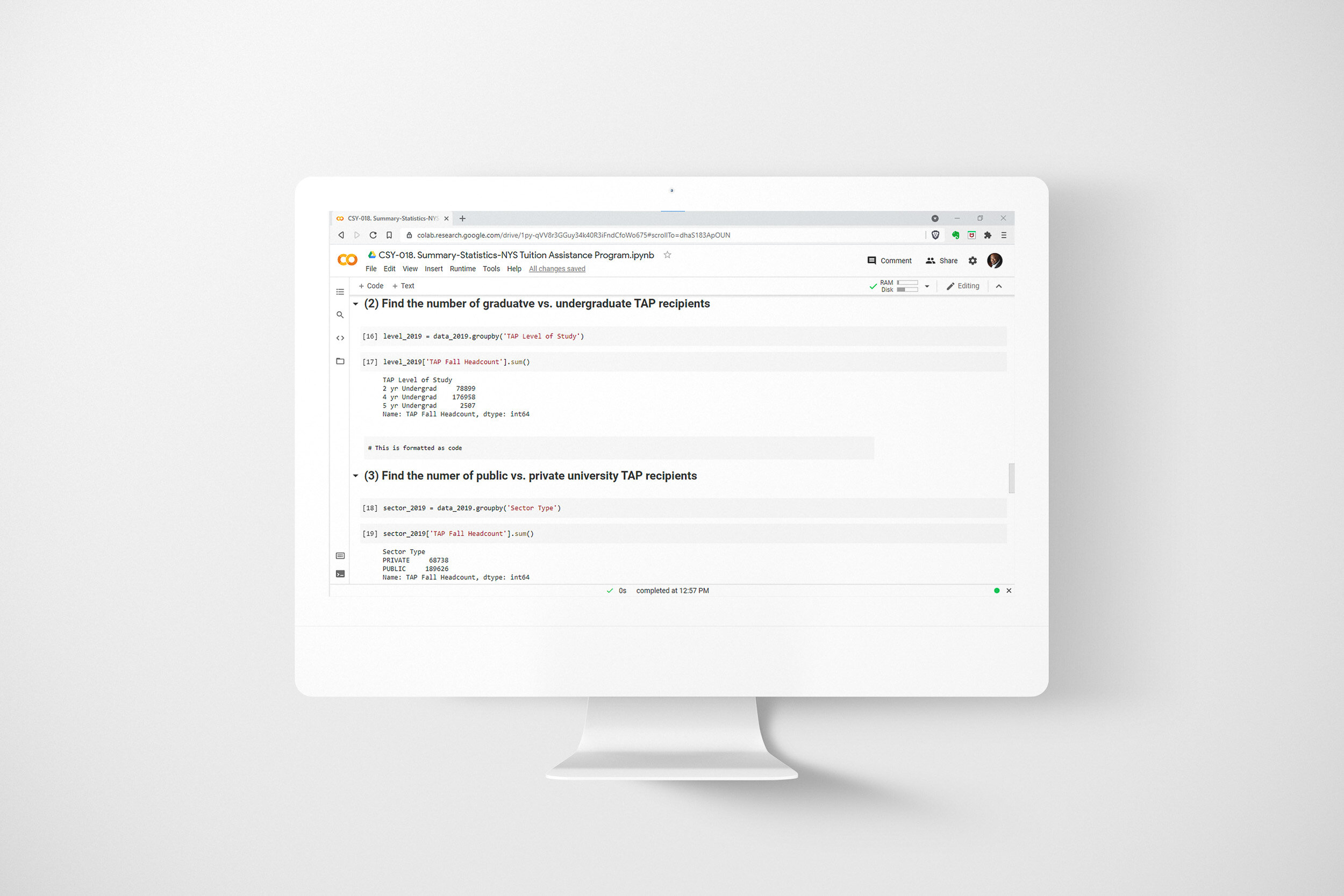
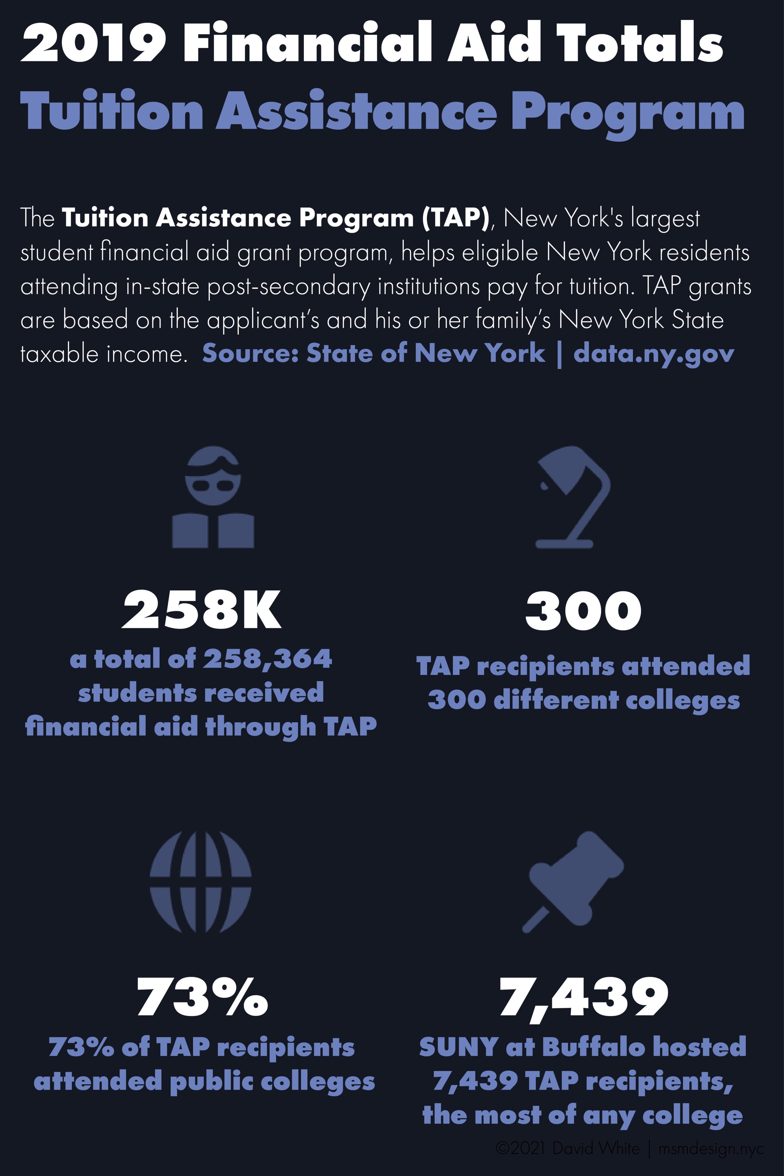
Infographics are simple data graphics that give a quick overview of a topic or set of information. Recently, I discovered a large dataset on student financial aid in the State of New York. I wanted to summarize the data and present it in the form of an infographic. Here are the steps I took to complete this self-directed project:
Step 1 - Discovery
My very first step was to gather all of the information I had and flesh out my ideas for what the infographic would communicate.
Step 2 - Sketch
Next, I made a rough sketch of what the infographic would look like and what information would go where. I used a grid structure so my design would look balanced and well-organized.
Step 3 - Prep Data
I located the financial aid data file on data.gov and downloaded it to my computer. I then uploaded it to my GitHub repository so I would be able to access it from any computer and others could easily access the data once my work was published.
Step 4 - Build
I calculated summary statistics using Python code and Google Colab. I chose Python because Python is capable of processing a large volume of data quickly and efficiently.
Step 5 - Publish
Finally, I created the graphic using Adobe Illustrator. Once finished, I exported the file in PNG format (image) and PDF format (document). Either format can easily be printed, shared via email or hosted online.