CSY-005. A visual that shows the effect that an external challenge is having on a nonprofit program.
PROJECT COMPLETED: April 2019
THE STORY OF THIS PROJECT
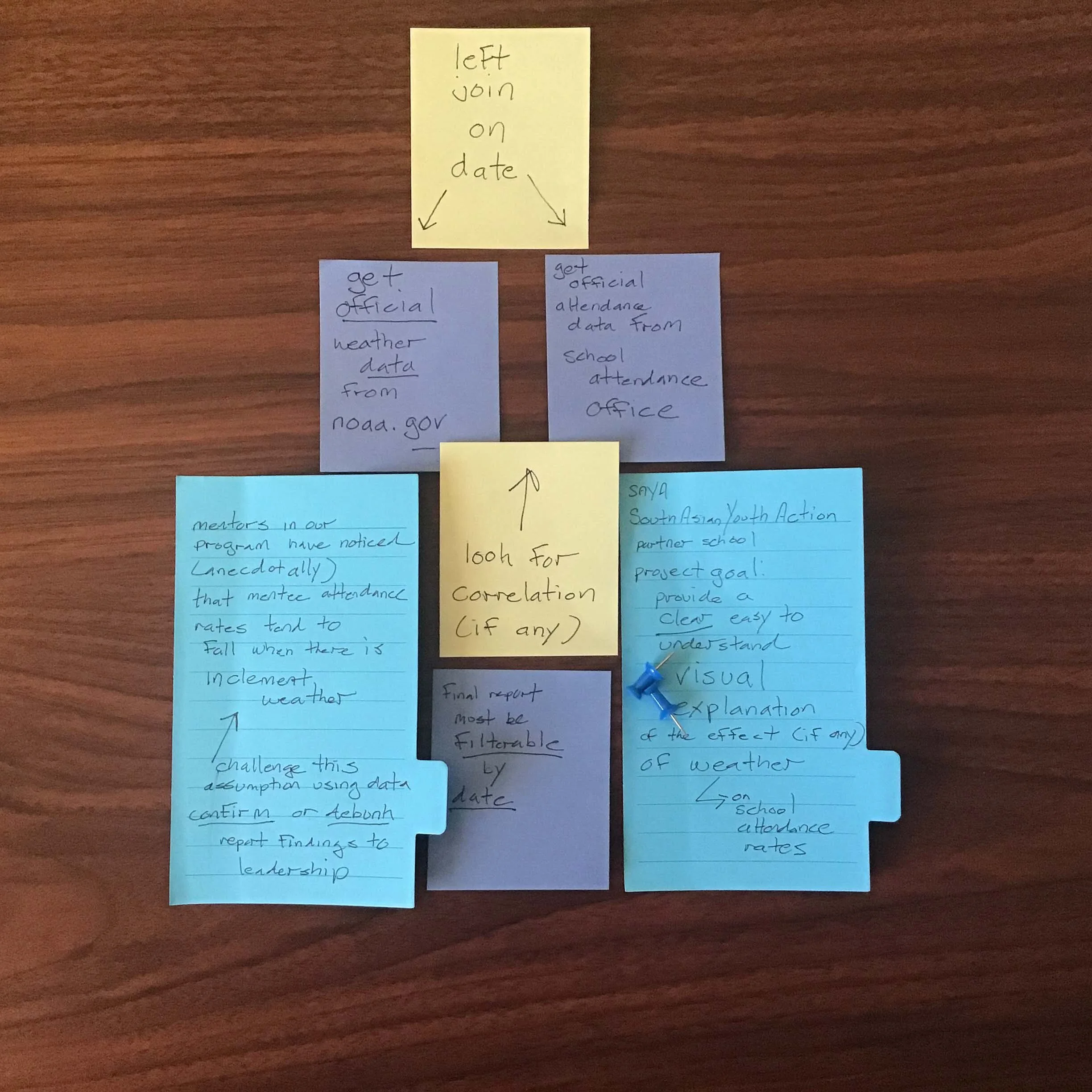
STAKEHOLDER’S PROBLEM: “We think we see something happening on the ground. We want to consult the data and have it either confirm our gut feeling or point us in the right direction.”
South Asian Youth Action (SAYA) is a 501(c)3 youth development organization based in Queens, NY. SAYA’s mission is to foster a strong sense of belonging in youth and provide them with tools to thrive academically, professionally and personally. It currently serves more than 1,500 kindergarten through college-aged youths throughout the City of New York.
As part of NYC’s Community Schools Initiative, SAYA partnered with Richmond Hill High School to operate a mentorship program designed to target at-risk students to improve their school attendance and prevent dropouts. Each week, SAYA’s program administrators and the school’s staff members who were serving as mentors, met to review student data and collaborate on ways they could better support the students enrolled in the mentorship program.
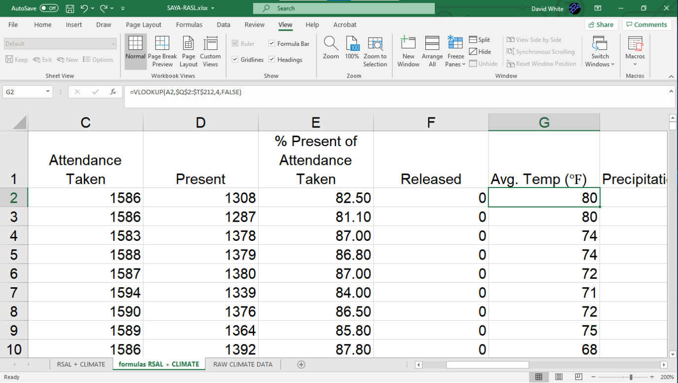
In the spring of 2019, the program’s mentors became concerned about the effect that weather was having on school attendance. They had anecdotal evidence that inclement weather or unseasonably warm temperatures were resulting in lower school attendance. However, they wanted a way to compare what they were witnessing individually to the overall data as a whole. To solve this problem, I designed and built an interactive data visualization that tracked the SAYA mentees’ school attendance against the weather conditions on each day school was in session.
Work Process:
Here’s the design process I used to complete this project—